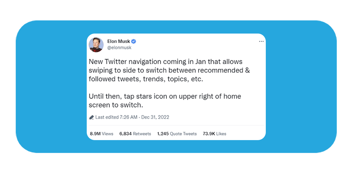
Elon Musk reviving stale old features

Back in the day, we all gullibly evacuated Myspace dot com for the new kid on the block living in his garage. Now more than ever, the old adage speaks huge volumes, as our regret-stricken older selves mourn the loss of a veteran whose worth is yet unacknowledged.
With Chief Twit running rampant, the blue bird app has been down in the doldrums and its frenzied updates on the trot.
Since December, Elon Musk has been teasing a “new” navigation – his tweet over the weekend confirming the comeback – that will have you swiping sideways to toggle between recommended vs followed content.
Rings an awfully familiar bell? We won’t be taking you too far down memory lane. Back in March 2022, Twitter stepped back on this same design change and stuck to the nebulous sparkle icon that still allowed your Latest’s reverse chronological timelines to coexist with the algorithmically-served Home feed.
Timelines are a virtue, and Twitter just blew up the very sine qua non of its true power. This rehashed sideways interface has been too disenchanting for survivors of the Twitter spats who chose to stick around. Infuriated users are complaining about the sudden sensitivity that’s triggering accidental swipes, trapping them inside a scroll-back-to-the-top maze.
It really is frustrating to see Twitter contort into a mere TikTok copycat. We get it, short-form video is the king of the era and the best catnip for your lost advertisers. But the anatomy of the swipe doesn’t belong here. We would go to TikTok if we wanted to.
*smh* #AintBrokeDontFix, #MakeTwitterGreatAgain!
All we asked for was an innocent edit button but were instead thrusted into an elite-run multiverse of madness. When will these walled gardens ever feel a little more like our own?
