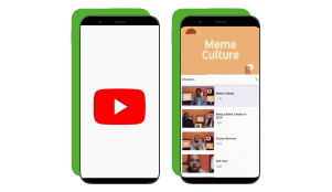
YouTube revamps viewing features & layout

It was only back in April that YouTube began testing the introduction of ‘video chapters’, dividers in the video scrubber bar providing extra contextual information about the video content at specific points in time.
And because we like them (we did!), YouTube has announced that they will not only be rolling them out to a wider number of creators and users, but also adding a quick and simple list view to easily browse and access any chapter in a video. That is not all, though, as the platform has also made layout changes to make the viewing experience more accessible:
- Closed Captions (CC) button moved to a more prominent location at the top right of the video player
- Autoplay toggle moved for easier access while watching a video
- New swipe-up to enter full screen and swipe-down to exit gestures
- New suggested actions, such as rotate view and VR activation
- New bedtime reminders
These might seem like small changes but they will surely improve your experience!
Learn more here
